Alerts
Provide contextual feedback messages for typical user actions with the handful of available and flexible alert messages.
Page Demo Bootstrap DocBasic Examples
Alerts are available for any length of text, as well as an optional dismiss button. For proper styling, use one of the four required contextual classes (e.g., .alert-success)
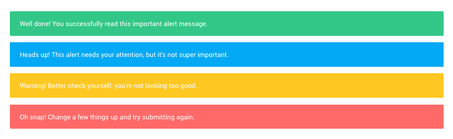
<div class="alert alert-success" role="alert">
    Well done! You successfully read this important alert message.
</div>
<div class="alert alert-info" role="alert">
    Heads up! This alert needs your attention, but it's not super important.
</div>
<div class="alert alert-warning" role="alert">
    Warning! Better check yourself, you're not looking too good.
</div>
<div class="alert alert-danger" role="alert">
    Oh snap! Change a few things up and try submitting again.
</div>
Links
Use the .alert-link utility class to quickly provide matching colored links within any alert.
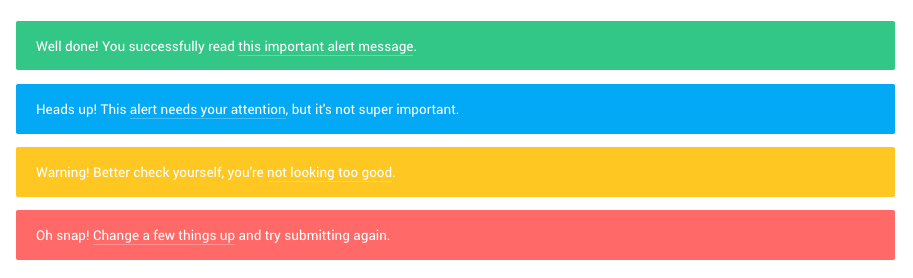
<div class="alert alert-success" role="alert">
    Well done! You successfully read <a href="#" class="alert-link">this important alert message</a>.
</div>
<div class="alert alert-info" role="alert">
    Heads up! This <a href="#" class="alert-link">alert needs your attention</a>, but it's not super important.
</div>
<div class="alert alert-warning" role="alert">
    Warning! Better check yourself, you're <a href="#" class="alert-link">not looking too good</a>.
</div>
<div class="alert alert-danger" role="alert">
    Oh snap! <a href="#" class="alert-link">Change a few things up</a> and try submitting again.
</div>
Additional content
Alerts can also contain additional HTML elements like headings and paragraphs.
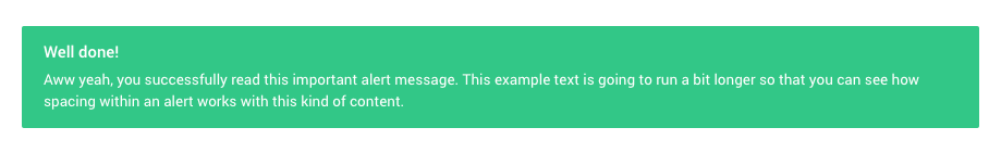
<div class="alert alert-success" role="alert">
    <h4 class="alert-heading">Well done!</h4>
    <p class="mb-0">Aww yeah, you successfully read this important alert message. This example text is going to run a bit longer so that you can see how spacing within an alert works with this kind of content.</p>
</div>
Dismissing
Alerts have dismiss option. Enabling it will show close button to the right of the alert.
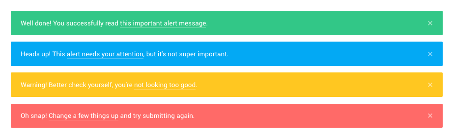
<div class="alert alert-success alert-dismissible fade show">
<button type="button" class="close" data-dismiss="alert" aria-label="Close">
<span aria-hidden="true">×</span>
</button>
Well done! You successfully read <a href="#" class="alert-link">this important alert message</a>.
</div>
<div class="alert alert-info alert-dismissible fade show">
<button type="button" class="close" data-dismiss="alert" aria-label="Close">
<span aria-hidden="true">×</span>
</button>
Heads up! This <a href="#" class="alert-link">alert needs your attention</a>, but it's not super important.
</div>
<div class="alert alert-warning alert-dismissible fade show">
<button type="button" class="close" data-dismiss="alert" aria-label="Close">
<span aria-hidden="true">×</span>
</button>
Warning! Better check yourself, you're <a href="#" class="alert-link">not looking too good</a>.
</div>
<div class="alert alert-danger alert-dismissible fade show">
<button type="button" class="close" data-dismiss="alert" aria-label="Close">
<span aria-hidden="true">×</span>
</button>
Oh snap! <a href="#" class="alert-link">Change a few things up</a> and try submitting again.
</div>Requirements:
/scss/inc/bootstrap-overrides/_alerts.scss