Typography
Documentation and examples for Material Admin typography, including global settings, headings, body text, lists, and more.
Page Demo Bootstrap DocBody Copy
Material Admin's root font-size is 13px, with a line-height of 1.15. This is applied to the body and all paragraphs. In addition, p (paragraphs) receive a bottom margin of 1rem.
<p>...</p>Heading
All HTML headings, h1 through h6, are available.
<h1>This is a Heading 1</h1>
<h2>This is a Heading 2</h2>
<h3>This is a Heading 3</h3>
<h4>This is a Heading 4</h4>
<h5>This is a Heading 5</h5>
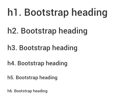
<h6>This is a Heading 6</h6>.h1 through .h6 classes are also available, for when you want to match the font styling of a heading but cannot use the associated HTML element.
<p class="h1">h1. Bootstrap heading</p>
<p class="h2">h2. Bootstrap heading</p>
<p class="h3">h3. Bootstrap heading</p>
<p class="h4">h4. Bootstrap heading</p>
<p class="h5">h5. Bootstrap heading</p>
<p class="h6">h6. Bootstrap heading</p>
Display headings
Traditional heading elements are designed to work best in the meat of your page content. When you need a heading to stand out, consider using a display heading - a larger, slightly more opinionated heading style.
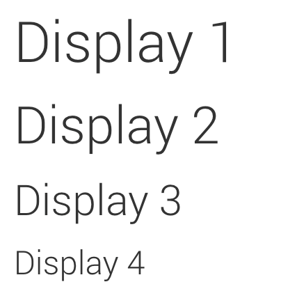
<h1 class="display-1">Display 1</h1>
<h1 class="display-2">Display 2</h1>
<h1 class="display-3">Display 3</h1>
<h1 class="display-4">Display 4</h1>
Lead
Make a paragraph stand out by adding .lead
<p class="lead">
  ...
</p>
Inline Text Elements
Styling for common inline HTML5 elements.
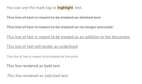
<p>You can use the mark tag to <mark>highlight</mark> text.</p>
<p><del>This line of text is meant to be treated as deleted text.</del></p>
<p><s>This line of text is meant to be treated as no longer accurate.</s></p>
<p><ins>This line of text is meant to be treated as an addition to the document.</ins></p>
<p><u>This line of text will render as underlined</u></p>
<p><small>This line of text is meant to be treated as fine print.</small></p>
<p><strong>This line rendered as bold text.</strong></p>
<p><em>This line rendered as italicized text.</em></p>
Text Utilities
Change text alignment, transform, style, weight, and color with Bootstrap's text utilities.
Easily realign text to components with text alignment classes.
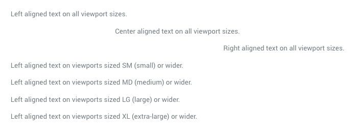
<p class="text-left">Left aligned text on all viewport sizes.</p>
<p class="text-center">Center aligned text on all viewport sizes.</p>
<p class="text-right">Right aligned text on all viewport sizes.</p>

<p class="text-sm-left">Left aligned text on viewports sized SM (small) or wider.</p>
<p class="text-md-left">Left aligned text on viewports sized MD (medium) or wider.</p>
<p class="text-lg-left">Left aligned text on viewports sized LG (large) or wider.</p>
<p class="text-xl-left">Left aligned text on viewports sized XL (extra-large) or wider.</p>
Transform text in components with text capitalization classes.
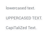
<p class="text-lowercase">Lowercased text.</p>
<p class="text-uppercase">Uppercased text.</p>
<p class="text-capitalize">CapiTaliZed text.</p>
Quickly change the weight (boldness) of text or italicize text.
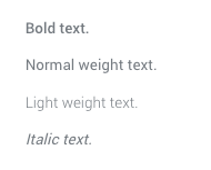
<p class="font-weight-bold">Bold text.</p>
<p class="font-weight-normal">Normal weight text.</p>
<p class="font-weight-light">Light weight text.</p>
<p class="font-italic">Italic text.</p>
Abbreviations
Stylized implementation of HTML's 'abbr' element for abbreviations and acronyms to show the expanded version on hover. Abbreviations with a 'title' attribute have a light dotted bottom border and a help cursor on hover, providing additional context on hover and to users of assistive technologies.
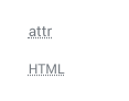
<abbr title="attribute">attr</abbr>
<abbr title="HyperText Markup Language" class="initialism">HTML</abbr>
Blockquotes
For quoting blocks of content from another source within your document.

<blockquote class="blockquote">
  <p class="mb-0">Lorem ipsum dolor sit amet, consectetur adipiscing elit. Integer posuere erat a ante.</p>
</blockquote>
<blockquote class="blockquote">
  <p class="mb-0">Lorem ipsum dolor sit amet, consectetur adipiscing elit. Integer posuere erat a ante.</p>
  <footer class="blockquote-footer">Someone famous in <cite title="Source Title">Source Title</cite></footer>
</blockquote>
<blockquote class="blockquote text-center">
  <p class="mb-0">Lorem ipsum dolor sit amet, consectetur adipiscing elit. Integer posuere erat a ante.</p>
  <footer class="blockquote-footer">Someone famous in <cite title="Source Title">Source Title</cite></footer>
</blockquote>

<blockquote class="blockquote text-right">
  <p class="mb-0">Lorem ipsum dolor sit amet, consectetur adipiscing elit. Integer posuere erat a ante.</p>
  <footer class="blockquote-footer">Someone famous in <cite title="Source Title">Source Title</cite></footer>
</blockquote>
Lists
Remove the default list-style and left margin on list items (immediate children only). This only applies to immediate children list items, meaning you will need to add the class for any nested lists as well.
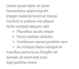
<ul class="list-unstyled">
  <li>Lorem ipsum dolor sit amet</li>
  <li>Consectetur adipiscing elit</li>
  <li>Integer molestie lorem at massa</li>
  <li>Facilisis in pretium nisl aliquet</li>
  <li>Nulla volutpat aliquam velit
    <ul>
      <li>Phasellus iaculis neque</li>
      <li>Purus sodales ultricies</li>
      <li>Vestibulum laoreet porttitor sem</li>
      <li>Ac tristique libero volutpat at</li>
    </ul>
  </li>
  <li>Faucibus porta lacus fringilla vel</li>
  <li>Aenean sit amet erat nunc</li>
  <li>Eget porttitor lorem</li>
</ul>
Remove a list’s bullets and apply some light margin with a combination of two classes, .list-inline and .list-inline-item.

<ul class="list-inline">
  <li class="list-inline-item">Lorem ipsum</li>
  <li class="list-inline-item">Phasellus iaculis</li>
  <li class="list-inline-item">Nulla volutpat</li>
</ul>
There are 3 custom styled lists are available.
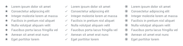
<ul class="list list--star">
  <li class="list-inline-item">Lorem ipsum</li>
  <li class="list-inline-item">Phasellus iaculis</li>
  <li class="list-inline-item">Nulla volutpat</li>
</ul>

<ul class="list list--check">
  <li class="list-inline-item">Lorem ipsum</li>
  <li class="list-inline-item">Phasellus iaculis</li>
  <li class="list-inline-item">Nulla volutpat</li>
</ul>

<ul class="list list--dot">
  <li class="list-inline-item">Lorem ipsum</li>
  <li class="list-inline-item">Phasellus iaculis</li>
  <li class="list-inline-item">Nulla volutpat</li>
</ul>
Description list alignment
Align terms and descriptions horizontally by using our grid system’s predefined classes (or semantic mixins). For longer terms, you can optionally add a .text-truncate class to truncate the text with an ellipsis.
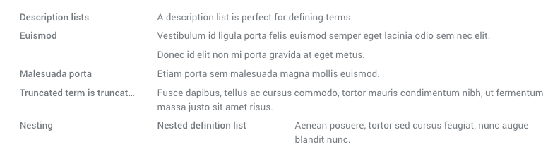
<dl class="row">
  <dt class="col-sm-3">Description lists</dt>
  <dd class="col-sm-9">A description list is perfect for defining terms.</dd>

  <dt class="col-sm-3">Euismod</dt>
  <dd class="col-sm-9">
    <p>Vestibulum id ligula porta felis euismod semper eget lacinia odio sem nec elit.</p>
    <p>Donec id elit non mi porta gravida at eget metus.</p>
  </dd>

  <dt class="col-sm-3">Malesuada porta</dt>
  <dd class="col-sm-9">Etiam porta sem malesuada magna mollis euismod.</dd>

  <dt class="col-sm-3 text-truncate">Truncated term is truncated</dt>
  <dd class="col-sm-9">Fusce dapibus, tellus ac cursus commodo, tortor mauris condimentum nibh, ut fermentum massa justo sit amet risus.</dd>

  <dt class="col-sm-3">Nesting</dt>
  <dd class="col-sm-9">
    <dl class="row">
      <dt class="col-sm-4">Nested definition list</dt>
      <dd class="col-sm-8">Aenean posuere, tortor sed cursus feugiat, nunc augue blandit nunc.</dd>
    </dl>
  </dd>
</dl>