Most of the basic form elements have been upgraded with custom markups and style in order to give a more Material Design friendly outcome. Official Bootstrap figures may not work here.
Form Controls
Textual form controls—like <input>s, <select>s, and <textarea>s—are styled with the .form-control class. Included are styles for general appearance, focus state, sizing, and more.
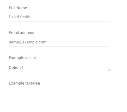
<div class="form-group">
    <label>Full Name</label>
    <input type="email" class="form-control" placeholder="David Smith">
    <i class="form-group__bar"></i>
</div>

<div class="form-group">
    <label>Email address</label>
    <input type="email" class="form-control" placeholder="[email protected]">
    <i class="form-group__bar"></i>
</div>

<div class="form-group">
    <label>Example select</label>
    <div class="select">
        <select class="form-control">
            <option>Option 1</option>
            <option>Option 2</option>
            <option>Option 3</option>
            <option>Option 4</option>
            <option>Option 5</option>
        </select>
        <i class="form-group__bar"></i>
    </div>
</div>

<div class="form-group">
    <label>Example textarea</label>
    <textarea class="form-control"></textarea>
    <i class="form-group__bar"></i>
</div>
Sizing
Set heights using classes like .form-control-lg and .form-control-sm.
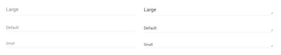
<div class="form-group">
    <input type="email" class="form-control form-control-lg" placeholder="Large">
    <i class="form-group__bar"></i>
</div>

<div class="form-group">
    <input type="email" class="form-control" placeholder="Default">
    <i class="form-group__bar"></i>
</div>

<div class="form-group">
    <input type="email" class="form-control form-control-sm" placeholder="Small">
    <i class="form-group__bar"></i>
</div>
Readonly
Add the readonly boolean attribute on an input to prevent modification of the input’s value. Read-only inputs appear lighter (just like disabled inputs), but retain the standard cursor.
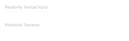
<div class="form-group">
    <input type="email" class="form-control" placeholder="Readonly Textual Input" readonly>
    <i class="form-group__bar"></i>
</div>

<div class="form-group">
    <textarea class="form-control" readonly placeholder="Readonly Textarea"></textarea>
    <i class="form-group__bar"></i>
</div>
Custom styled checkboxes and radios
Each checkbox and radio is wrapped in a <div> to create our custom control and a <label> for the accompanying text.
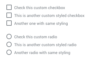
<!-- Checkbox -->
<div class="checkbox">
    <input type="checkbox" id="customCheck1">
    <label class="checkbox__label" for="customCheck1">Check this custom checkbox</label>
</div>


<!-- Radio -->
<div class="radio">
    <input type="radio" name="customRadio" id="customRadio1">
    <label class="radio__label" for="customRadio1">Check this custom radio</label>
</div>
<div class="radio">
    <input type="radio" name="customRadio" id="customRadio2">
    <label class="radio__label" for="customRadio2">This is another custom styled radio</label>
</div>
Inline
Add class .checkbox--inline or .radio--inline to make the inputs inline
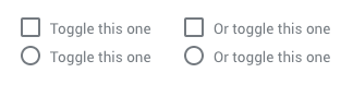
<!-- Checkbox -->
<div class="checkbox checkbox--inline">
    <input type="checkbox" id="customCheck4">
    <label class="checkbox__label" for="customCheck4">Toggle this one</label>
</div>


<!-- Radio -->
<div class="radio radio--inline">
    <input type="radio" name="customRadio" id="customRadio4">
    <label class="radio__label" for="customRadio4">Toggle this one</label>
</div>
<div class="radio radio--inline">
    <input type="radio" name="customRadio" id="customRadio5">
    <label class="radio__label" for="customRadio5">Or toggle this one</label>
</div>
Disabled
Add attribute diasbled on the input elements where you need to make them disabled
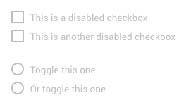
<!-- Checkbox -->
<div class="checkbox">
    <input type="checkbox" id="customCheck6" disabled>
    <label class="checkbox__label" for="customCheck6">This is a disabled checkbox</label>
</div>


<!-- Radio -->
<div class="radio">
    <input type="radio" name="customRadio" id="customRadio6" disabled>
    <label class="radio__label" for="customRadio6">Toggle this one</label>
</div>