Dropdown
Toggle contextual overlays for displaying lists of links and more with the Bootstrap dropdown plugin.
Page Demo Bootstrap DocBasic Example
Basic dropdown example with a link used for toggle.
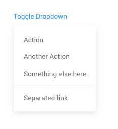
<div class="dropdown">
    <a href="" data-toggle="dropdown">Toggle Dropdown</a>
    <div class="dropdown-menu">
        <a href="" class="dropdown-item">Action</a>
        <a href="" class="dropdown-item">Another Action</a>
        <a href="" class="dropdown-item">Something else here</a>
        <div class="dropdown-divider"></div>
        <a href="" class="dropdown-item">Separated link</a>
    </div>
</div>
Single button dropdowns
Any single .btn can be turned into a dropdown toggle with some markup changes. Here’s how you can put them to work with either <button> elements:
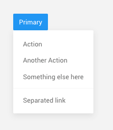
<div class="dropdown">
    <button class="btn btn-primary" data-toggle="dropdown">Primary</button>
    <div class="dropdown-menu">
        <a href="" class="dropdown-item">Action</a>
        <a href="" class="dropdown-item">Another Action</a>
        <a href="" class="dropdown-item">Something else here</a>
        <div class="dropdown-divider"></div>
        <a href="" class="dropdown-item">Separated link</a>
    </div>
</div>
Split button dropdowns
Similarly, create split button dropdowns with virtually the same markup as single button dropdowns, but with the addition of .dropdown-toggle-split for proper spacing around the dropdown caret.
Bootstrap use this extra class to reduce the horizontal padding on either side of the caret by 25% and remove the margin-left that’s added for regular button dropdowns. Those extra changes keep the caret centered in the split button and provide a more appropriately sized hit area next to the main button.
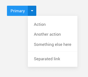
<div class="btn-group" dropdown>
    <button id="split-button" type="button" class="btn btn-primary">Primary</button>
    <button type="button" class="btn btn-primary dropdown-toggle dropdown-toggle-split" data-toggle="dropdown">
        <span class="caret"></span>
    </button>

    <ul class="dropdown-menu">
        <li><a class="dropdown-item" href="#">Action</a></li>
        <li><a class="dropdown-item" href="#">Another action</a></li>
        <li><a class="dropdown-item" href="#">Something else here</a></li>
        <li class="divider dropdown-divider"></li>
        <li><a class="dropdown-item" href="#">Separated link</a></li>
    </ul>
</div>
Disabled
Use disabled attribute on data-toggle="dropdown" to disable the toggle.
<div class="dropdown">
    <button class="btn btn-primary" data-toggle="dropdown" disabled>Primary</button>
    <div class="dropdown-menu">
        <a href="" class="dropdown-item">Action</a>
        <a href="" class="dropdown-item">Another Action</a>
        <a href="" class="dropdown-item">Something else here</a>
        <div class="dropdown-divider"></div>
        <a href="" class="dropdown-item">Separated link</a>
    </div>
</div>
Menu alignment
By default, a dropdown menu is automatically positioned 100% from the top and along the left side of its parent. Add .dropdown-menu-right to a .dropdown-menu to right align the dropdown menu.
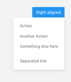
<div class="dropdown">
    <button class="btn btn-light" data-toggle="dropdown">Right aligned</button>
    <div class="dropdown-menu dropdown-menu-right">
        <a href="" class="dropdown-item">Action</a>
        <a href="" class="dropdown-item">Another Action</a>
        <a href="" class="dropdown-item">Something else here</a>
        <div class="dropdown-divider"></div>
        <a href="" class="dropdown-item">Separated link</a>
    </div>
</div>
Directions
Trigger dropdown menus in any side by adding respective parent classes.
Trigger dropdown menus above elements by adding .dropup to the parent element.
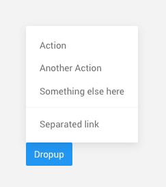
<div class="dropup">
    <button class="btn btn-light" data-toggle="dropdown">Dropup</button>
    <div class="dropdown-menu">
        <a href="" class="dropdown-item">Action</a>
        <a href="" class="dropdown-item">Another Action</a>
        <a href="" class="dropdown-item">Something else here</a>
        <div class="dropdown-divider"></div>
        <a href="" class="dropdown-item">Separated link</a>
    </div>
</div>
Trigger dropdown menus at the right of the elements by adding .dropright to the parent element.
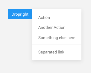
<div class="dropright">
    <button class="btn btn-light" data-toggle="dropdown">Dropright</button>
    <div class="dropdown-menu">
        <a href="" class="dropdown-item">Action</a>
        <a href="" class="dropdown-item">Another Action</a>
        <a href="" class="dropdown-item">Something else here</a>
        <div class="dropdown-divider"></div>
        <a href="" class="dropdown-item">Separated link</a>
    </div>
</div>
Trigger dropdown menus at the left of the elements by adding .dropleft to the parent element.
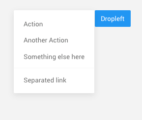
<div class="dropleft">
    <button class="btn btn-light" data-toggle="dropdown">Dropleft</button>
    <div class="dropdown-menu">
        <a href="" class="dropdown-item">Action</a>
        <a href="" class="dropdown-item">Another Action</a>
        <a href="" class="dropdown-item">Something else here</a>
        <div class="dropdown-divider"></div>
        <a href="" class="dropdown-item">Separated link</a>
    </div>
</div>
Active and Disabled menu item stats
Add .active to items in the dropdown to style them as active.
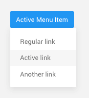
<div class="dropdown">
    <button class="btn btn-light" data-toggle="dropdown">Active Menu Item</button>
    <div class="dropdown-menu">
        <a class="dropdown-item" href="#">Regular link</a>
        <a class="dropdown-item active" href="#">Active link</a>
        <a class="dropdown-item" href="#">Another link</a>
    </div>
</div>
Add .disabled to items in the dropdown to style them as disabled.
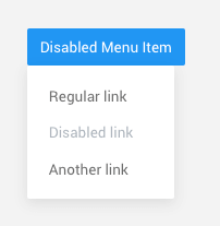
<div class="dropdown">
    <button class="btn btn-light" data-toggle="dropdown">Disabled Menu Item</button>
    <div class="dropdown-menu">
        <a class="dropdown-item" href="#">Regular link</a>
        <a class="dropdown-item disabled" href="#">Disabled link</a>
        <a class="dropdown-item" href="#">Another link</a>
    </div>
</div>
Menu content
Add a header to label sections of actions in any dropdown menu.
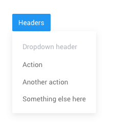
<div class="dropdown">
    <button class="btn btn-light" data-toggle="dropdown">Headers</button>
    <div class="dropdown-menu">
        <h6 class="dropdown-header">Dropdown header</h6>

        <a class="dropdown-item" href="#">Action</a>
        <a class="dropdown-item" href="#">Another action</a>
        <a class="dropdown-item" href="#">Something else here</a>
    </div>
</div>
Separate groups of related menu items with a divider.
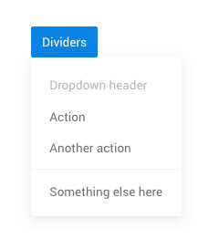
<div class="dropdown">
    <button class="btn btn-light" data-toggle="dropdown">Dividers</button>
    <div class="dropdown-menu">
        <a class="dropdown-item" href="#">Action</a>
        <a class="dropdown-item" href="#">Another action</a>
        <div class="dropdown-divider"></div>
        <a class="dropdown-item" href="#">Something else here</a>
    </div>
</div>
Place any freeform text within a dropdown menu with text and use pacing utilitiess. Note that you’ll likely need additional sizing styles to constrain the menu width.
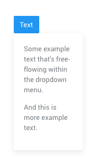
<div class="dropdown">
    <button class="btn btn-light" data-toggle="dropdown">Text</button>
    <div class="dropdown-menu p-4">
        <p>Some example text that's free-flowing within the dropdown menu.</p>
        <p>And this is more example text.</p>
    </div>
</div>
Requirements:
/scss/inc/bootstrap-overrides/_dropdown.scss