Tooltips
Custom Bootstrap tooltips with CSS and JavaScript using CSS3 for animations and data-attributes for local title storage.
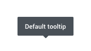
Page Demo Bootstrap DocEnabling Tooltips
One way to initialize all tooltips on a page would be to select them by their data-toggle attribute:
<button type="button" class="btn btn-secondary" data-toggle="tooltip" title="Tooltip on top">
    Basic Tooltip
</button>
if($('[data-toggle="tooltip"]')[0]) {
$('[data-toggle="tooltip"]').tooltip();
}All four directions
Four positioning options are available: top, right, bottom, and left aligned.
<!-- Top (default) -->
<button type="button" class="btn btn-light" data-toggle="tooltip" data-placement="top" title="Tooltip on top">
    Tooltip on top
</button>

<!-- Right -->
<button type="button" class="btn btn-light" data-toggle="tooltip" data-placement="right" title="Tooltip on right">
    Tooltip on right
</button>

<!-- Bottom -->
<button type="button" class="btn btn-light" data-toggle="tooltip" data-placement="bottom" title="Tooltip on bottom">
    Tooltip on bottom
</button>

<!-- Left -->
<button type="button" class="btn btn-light" data-toggle="tooltip" data-placement="left" title="Tooltip on left">
    Tooltip on left
</button>
Requirements:
/scss/inc/bootstrap-overrides/_tooltip.scss