Colors
Convey meaning through color with a handful of color utility classes. Includes support for styling links with hover states, too.
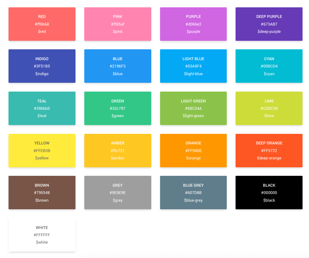
Page DemoSCSS Variables
All these colors are available in SCSS variables. You can include this with any class/ID as mentioned below.
.highlight-block {
  background-color: @red;
  color: @green;
}
CSS Classes
In addition to the Bootstrap's color classes, Material Admin also includes custom color/background utility classes for all the colors shown above.
<!-- Text -->
.text-primary
.text-secondary
.text-success
.text-danger
.text-warning
.text-info
.text-light
.text-dark
.text-muted
.text-white

<!-- Background -->
.bg-primary
.bg-secondary
.bg-success
.bg-danger
.bg-warning
.bg-info
.bg-light
.bg-dark
.bg-muted
.bg-white
<!-- Text -->
.text-white
.text-black
.text-pink
.text-purple
.text-deep-purple
.text-indigo
.text-blue
.text-light-blue
.text-cyan
.text-teal
.text-green
.text-light-green
.text-yellow
.text-amber
.text-orange
.text-deep-orange
.text-brown
.text-blue-grey
<!-- Background -->
.bg-white
.bg-black
.bg-pink
.bg-purple
.bg-deep-purple
.bg-indigo
.bg-blue
.bg-light-blue
.bg-cyan
.bg-teal
.bg-green
.bg-light-green
.bg-yellow
.bg-amber
.bg-orange
.bg-deep-orange
.bg-brown
.bg-blue-greyExample usage:
<!-- Text -->
<p class="text-red">Lorem Ipsum</p>

<!-- Background -->
<span class="bg-blue">Mattis Tortor</span>

<!-- Both color and background -->
<div class="text-white bg-black">Venenatis Dapibus Ultricies</div>
Requirements:
/scss/inc/_generics.scss