Collapse
The Bootstrap collapse plugin allows you to toggle content on your pages with a few classes thanks to some helpful JavaScript.
Page Demo Bootstrap DocBasic example
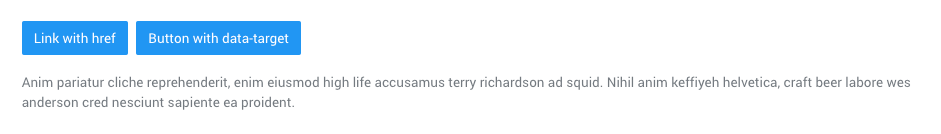
Click the buttons below to show and hide another element via class changes:
.collapse: hides content.collapsing: is applied during transitions.collapse.show: shows content
You can use a link with the href attribute, or a button with the data-target attribute. In both cases, the data-toggle="collapse" is required.
<p>
    <a class="btn btn-primary" data-toggle="collapse" href="#collapseExample" aria-expanded="false" aria-controls="collapseExample">
        Link with href
    </a>

    <button class="btn btn-primary" type="button" data-toggle="collapse" data-target="#collapseExample" aria-expanded="false" aria-controls="collapseExample">
        Button with data-target
    </button>
</p>

<div class="collapse" id="collapseExample">
    <div class="card card-body">
        Anim pariatur cliche reprehenderit, enim eiusmod high life accusamus terry richardson ad squid. Nihil anim keffiyeh helvetica, craft beer labore wes anderson cred nesciunt sapiente ea proident.
    </div>
</div>
Multiple targets
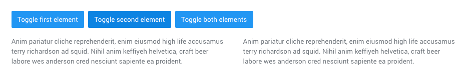
A <button> or <a> can show and hide multiple elements by referencing them with a JQuery selector in its href or data-target attribute. Multiple <button> or <a> can show and hide an element if they each reference it with their href or data-target attribute
<p>
<a class="btn btn-primary" data-toggle="collapse" href="#multiCollapseExample1" aria-expanded="false" aria-controls="multiCollapseExample1">Toggle first element</a>
<button class="btn btn-primary" type="button" data-toggle="collapse" data-target="#multiCollapseExample2" aria-expanded="false" aria-controls="multiCollapseExample2">Toggle second element</button>
<button class="btn btn-primary" type="button" data-toggle="collapse" data-target=".multi-collapse" aria-expanded="false" aria-controls="multiCollapseExample1 multiCollapseExample2">Toggle both elements</button>
</p>
<div class="row">
<div class="col">
<div class="collapse multi-collapse" id="multiCollapseExample1">
<div class="card card-body">
Anim pariatur cliche reprehenderit, enim eiusmod high life accusamus terry richardson ad squid. Nihil anim keffiyeh helvetica, craft beer labore wes anderson cred nesciunt sapiente ea proident.
</div>
</div>
</div>
<div class="col">
<div class="collapse multi-collapse" id="multiCollapseExample2">
<div class="card card-body">
Anim pariatur cliche reprehenderit, enim eiusmod high life accusamus terry richardson ad squid. Nihil anim keffiyeh helvetica, craft beer labore wes anderson cred nesciunt sapiente ea proident.
</div>
</div>
</div>
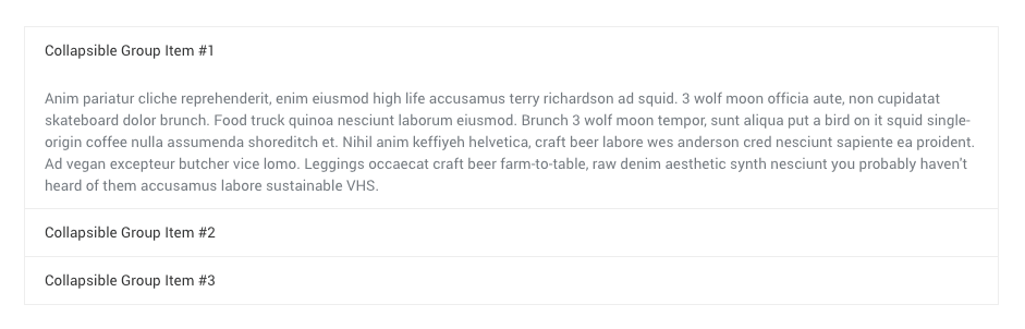
</div>Accordion example
Extend the default collapse behavior to create an accordion.
Accordion component has been upgraded with custom markups and style in order to give a more Material Design friendly outcome. Official Bootstrap figures may not work here.
<div class="accordion" role="tablist">
    <div class="accordion__item">
        <div class="accordion__title" data-toggle="collapse" data-target="#collapseOne">Collapsible Group Item #1</div>

        <div id="collapseOne" class="collapse" data-parent="#accordion">
            <div class="accordion__content">
                Anim pariatur cliche reprehenderit, enim eiusmod high life accusamus terry richardson ad squid. 3 wolf moon officia aute, non cupidatat skateboard dolor brunch. Food truck quinoa nesciunt laborum eiusmod. Brunch 3 wolf moon tempor, sunt aliqua put a bird on it squid single-origin coffee nulla assumenda shoreditch et. Nihil anim keffiyeh helvetica, craft beer labore wes anderson cred nesciunt sapiente ea proident. Ad vegan excepteur butcher vice lomo. Leggings occaecat craft beer farm-to-table, raw denim aesthetic synth nesciunt you probably haven't heard of them accusamus labore sustainable VHS.
            </div>
        </div>
    </div>

    <div class="accordion__item">
        <div class="collapsed accordion__title" data-toggle="collapse" data-target="#collapseTwo">Collapsible Group Item #2</div>

        <div id="collapseTwo" class="collapse" data-parent="#accordion">
            <div class="accordion__content">
                Anim pariatur cliche reprehenderit, enim eiusmod high life accusamus terry richardson ad squid. 3 wolf moon officia aute, non cupidatat skateboard dolor brunch. Food truck quinoa nesciunt laborum eiusmod. Brunch 3 wolf moon tempor, sunt aliqua put a bird on it squid single-origin coffee nulla assumenda shoreditch et. Nihil anim keffiyeh helvetica, craft beer labore wes anderson cred nesciunt sapiente ea proident. Ad vegan excepteur butcher vice lomo. Leggings occaecat craft beer farm-to-table, raw denim aesthetic synth nesciunt you probably haven't heard of them accusamus labore sustainable VHS.
            </div>
        </div>
    </div>

    <div class="accordion__item">
        <div class="collapsed accordion__title" data-toggle="collapse" data-target="#collapseThree">Collapsible Group Item #3</div>

        <div id="collapseThree" class="collapse" data-parent="#accordion">
            <div class="accordion__content">
                Anim pariatur cliche reprehenderit, enim eiusmod high life accusamus terry richardson ad squid. 3 wolf moon officia aute, non cupidatat skateboard dolor brunch. Food truck quinoa nesciunt laborum eiusmod. Brunch 3 wolf moon tempor, sunt aliqua put a bird on it squid single-origin coffee nulla assumenda shoreditch et. Nihil anim keffiyeh helvetica, craft beer labore wes anderson cred nesciunt sapiente ea proident. Ad vegan excepteur butcher vice lomo. Leggings occaecat craft beer farm-to-table, raw denim aesthetic synth nesciunt you probably haven't heard of them accusamus labore sustainable VHS.
            </div>
        </div>
    </div>
</div>
Requirements:
/scss/inc/bootstrap-overrides/_collapse.scss