Button Checkboxes and Radios
Control button states or create groups of buttons for more components like toolbars.
Page DemoButton checkboxes and radios module have been upgraded with custom markups and style in order to give a more Material Design friendly outcome. Official Bootstrap figures may not work here.
Toggle states
Add data-toggle="button" to toggle a button’s active state. If you’re pre-toggling a button, you must manually add the .active class and aria-pressed="true" to the <button>.

<button type="button" class="btn btn-primary" data-toggle="button" aria-pressed="false" autocomplete="off">
    Single toggle
</button>
Checkbox and Radio Buttons
Bootstrap’s .button styles can be applied to other elements, such as <label>s, to provide checkbox or radio style button toggling.
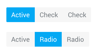
<!-- Checkbox -->
<div class="btn-group btn-group-toggle" data-toggle="buttons">
    <label class="btn active">
        <input type="checkbox" checked autocomplete="off"> Active
    </label>
    <label class="btn">
        <input type="checkbox" autocomplete="off"> Check
    </label>
    <label class="btn">
        <input type="checkbox" autocomplete="off"> Check
    </label>
</div>

<!-- Radio -->
<div class="btn-group btn-group-toggle" data-toggle="buttons">
    <label class="btn active">
        <input type="radio" name="options" id="option1" autocomplete="off" checked> Active
    </label>
    <label class="btn">
        <input type="radio" name="options" id="option2" autocomplete="off"> Radio
    </label>
    <label class="btn">
        <input type="radio" name="options" id="option3" autocomplete="off"> Radio
    </label>
</div>
Button color pickers
These toggle buttons are designed to pick a color from given list.
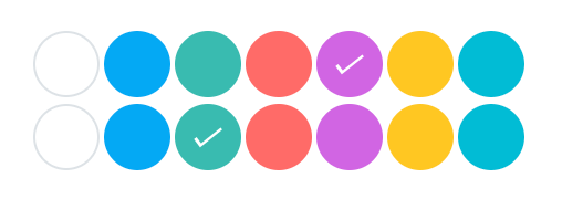
<!-- Checkbox -->
<div class="btn-group btn-group--colors btn-group-toggle" data-toggle="buttons">
    <label class="btn"><input type="checkbox" autocomplete="off" checked></label>
    <label class="btn bg-light-blue"><input type="checkbox" autocomplete="off"></label>
    <label class="btn bg-teal"><input type="checkbox" autocomplete="off"></label>
    <label class="btn bg-red"><input type="checkbox" autocomplete="off"></label>
    <label class="btn bg-purple active"><input type="checkbox" autocomplete="off"></label>
    <label class="btn bg-amber"><input type="checkbox" autocomplete="off"></label>
    <label class="btn bg-cyan"><input type="checkbox" autocomplete="off"></label>
</div>


<!-- Radio -->
<div class="btn-group btn-group--colors btn-group-toggle" data-toggle="buttons">
    <label class="btn"><input type="radio" name="notes-color" autocomplete="off" checked></label>
    <label class="btn bg-light-blue"><input type="radio" name="notes-color" autocomplete="off"></label>
    <label class="btn bg-teal active"><input type="radio" name="notes-color" autocomplete="off"></label>
    <label class="btn bg-red"><input type="radio" name="notes-color" autocomplete="off"></label>
    <label class="btn bg-purple"><input type="radio" name="notes-color" autocomplete="off"></label>
    <label class="btn bg-amber"><input type="radio" name="notes-color" autocomplete="off"></label>
    <label class="btn bg-cyan"><input type="radio" name="notes-color" autocomplete="off"></label>
</div>
Requirements:
/scss/inc/bootstrap-overrides/_buttons.scss